The Regional Economic Analysis Project (REAP) is the brainchild of retired professor Gary Smith of Washington State University. Along with the charts and tables, REAP includes analysis on what things mean, and just as important, what they don’t mean. Just poking around on it, I found several cautionary tales of other numbers to check before reaching a conclusion. Being the work of a former professor, REAP is as much a teaching tool as a source of information. The site is arranged by state, county, and regions (groups of counties).
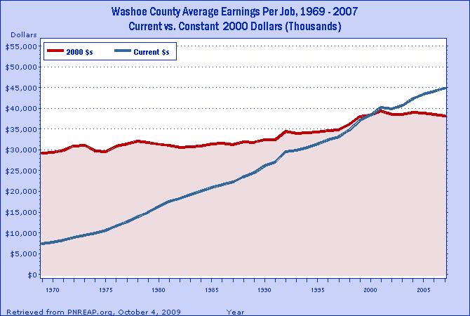
From the main page, click on Nevada. This brings you to a drop down menu of economic categories, and after choosing one, you get a list on the right of counties and regions. Here's the per capita income of Washoe County. It has the added bonus of showing inflation. The blue line shows actual dollars while the red line shows inflation adjusted dollars (buying power).
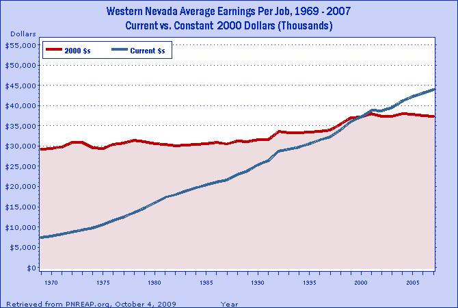
Here's our region showing Washoe, Carson, Story, and Douglas Counties. The numbers are slightly different, but the trends are the same.
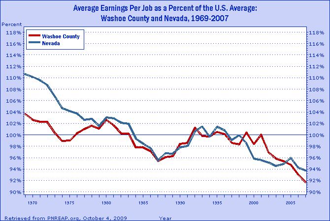
This chart shows the earnings per job in Washoe County and Nevada. 100% is the national average and is used as the baseline. This chart comes with a cautionary tale. Since it measures both full and part-time employment, sometimes a rise in part-time jobs can cause a decrease in the overall average. One would have to look through the employment numbers before reaching a conclusion.
There are ways to combine the charts and tables, but I'm still just poking around here. Did I mention I take lousy notes? Luckily, there are instructions, and Dr. Smith is happy to help.
Alison Adam heads up the Bureau of Economic Analysis website. She was at the workshop to explain the new inter-active features. From the main page, click on Regional and then quick links. This brings you to the inter-active menu. At the bottom is Local Area Personal Income and Employment. Click on charts and that brings you to a design-your-own section. Again, just poking around to see what I could find, I made this one.
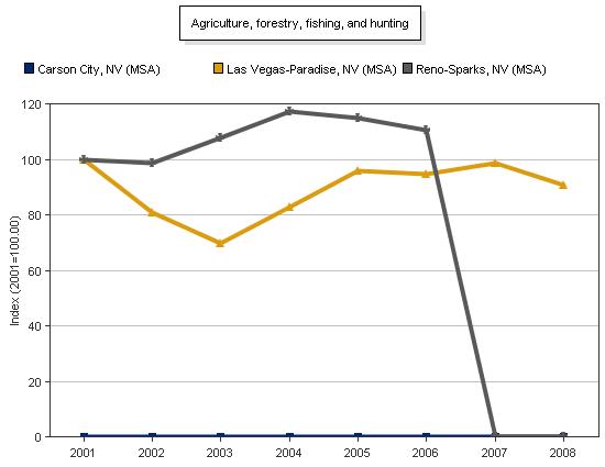
Although the chart is labeled Agriculture, Forestry, Hunting and Fishing, we can rule out the last three and focus on agriculture within city limits. Whether this chart shows the disappearance of open space in the south meadows or ranch land in the north valleys would take some research. But, seeing as how that disappearance happened right at the top of the real estate boom, one thing we can say with absolute certainty is - Mama didn't raise no fool out there on the farm!
Both of these websites are a gold mine of local information from credible, unbiased sources. The entire experience of the workshop seems to me the way things ought to be; a university offering knowledgeable, experienced speakers to anyone who wants to listen, a government department genuinely interested in providing useful information to the people, and a retired professor taking it upon himself to educate the general public. It was a very positive experience all around.



No comments:
Post a Comment